Ah, the classic “pick a topical theme” and build some kind of visualization persuading people to act. I have a love/hate relationship with these projects because I know that the concepts that are topical to me are not necessarily to others.
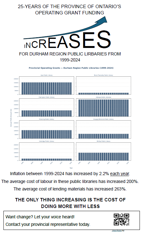
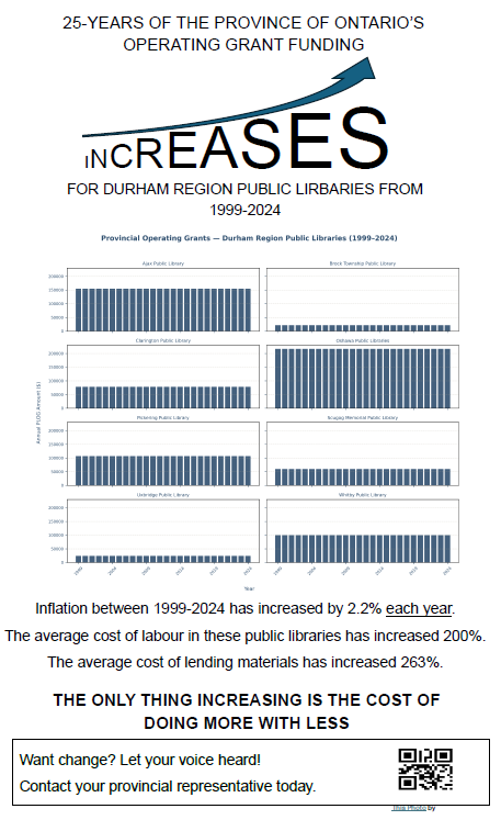
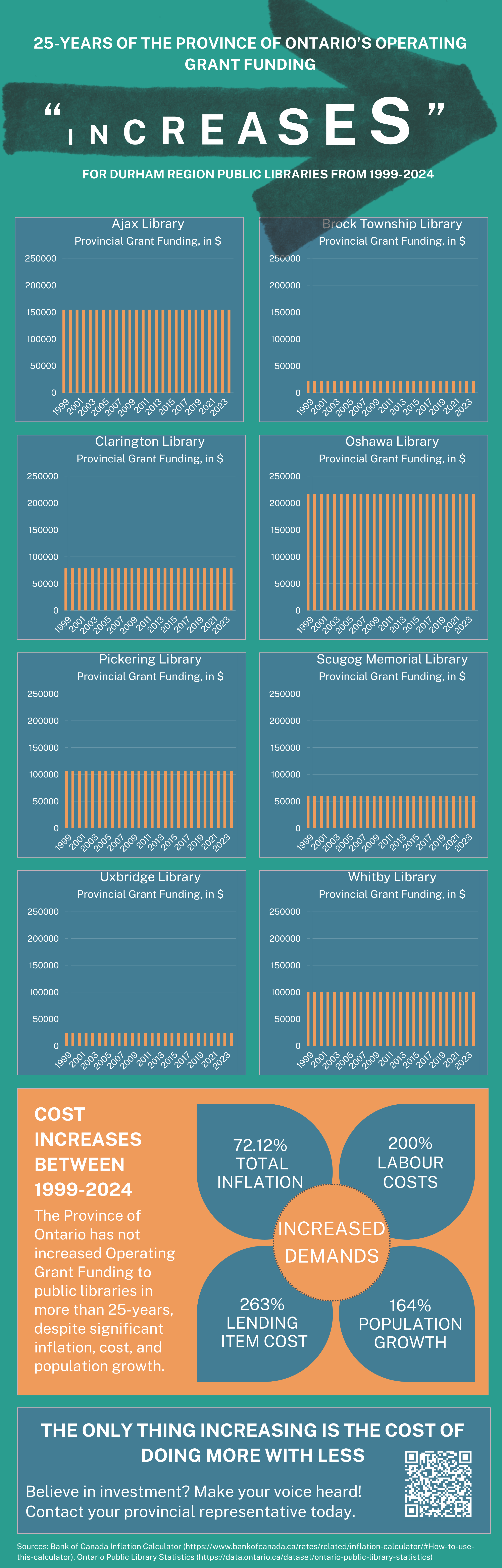
Case in point, I chose a library-related topic. Specifically, public libraries in Ontario have not seen increases to their provincial funding in 25 years. Some library systems in Durham Region in particular struggle with their budgets and this stagnant funding is actively hurting them.
Is this really a prototypical “topical theme”? Not really. But, my professor had suggested that I find ways to make peace with Python and look up library project tutorials on YouTube. Instead, I forced myself to make my own library-related Python project.
So, let the pain begin.
Hours spent fighting the 25 different CSVs from Ontario’s Data Catalogue trying to normalize columns with constantly changing nomenclature.
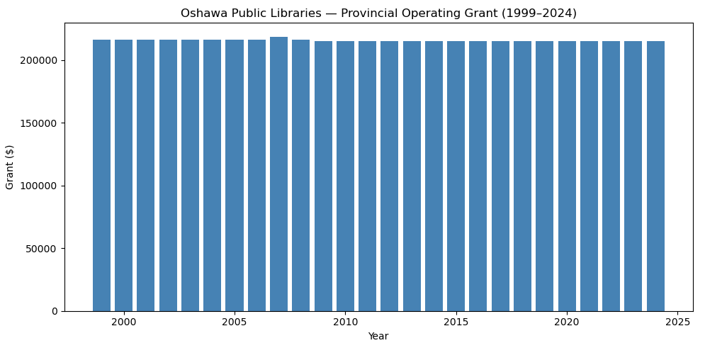
Finally getting Oshawa Public Libraries to map successfully! I think I cheered when this appeared.
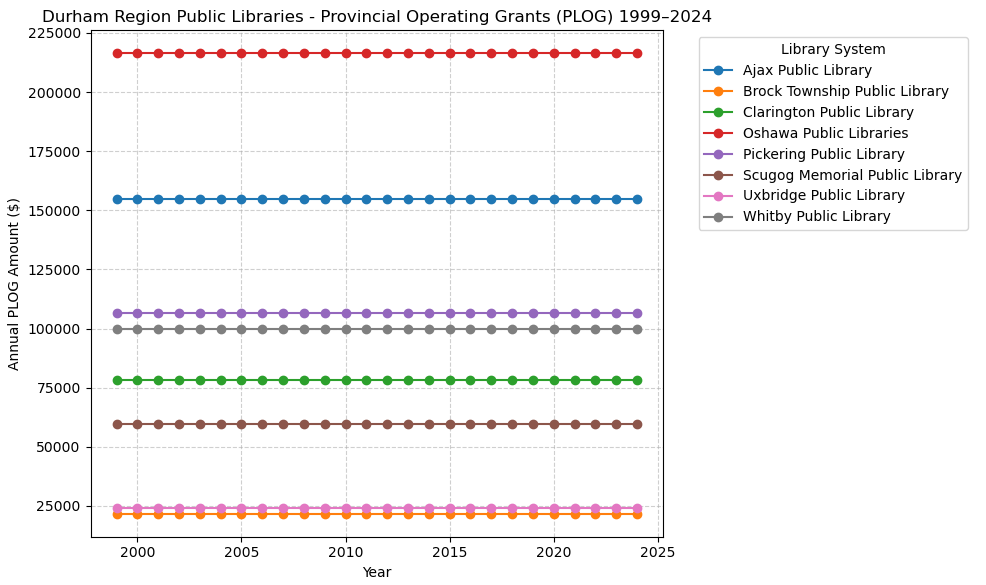
And now, all systems in the Durham Region are mapping. And I love colours, but this was too many for a single infographic. And my professor had cautioned us about using a line chart in an infographic.
So, the data was working for me now. Before trying to finalize the ultimate plotting that I would do, I needed to draft a rough idea of what I was hoping to build.
While I managed to plot everything for the Durham Region into one very colourful chart, I knew that I would want the individual library systems to remain separate. There is a lot of resistance to anything resembling discussion of amalgamation and I worried that grouping funding together might give that impression. It would also make the total value of funding to the Durham Region seem unnaturally large, possibly giving the impression that these library systems are in fact well-funded.
Also, I really wanted to highlight the disparity that exists in Durham Region. Some library systems get nearly ten times the amount of money as others.
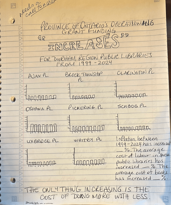
I have a confession to make: I love to make graphics like this in Word.
I know, I know, I know.
But ten years ago, while I was completing my Library Technician Diploma, I used Word to make nearly everything. I can manipulate graphics quickly in Word just from muscle memory at this point.
So, with my youngest daughter, who is in the graphic design program at George Brown, laughing at me using Word, I was able to whip this up in less than thirty minutes.
Something that I felt strongly about was triggering a little cognitive dissonance with my infographic. You can see that I am implying that funding is increasing in the title, but then you look at each bar chart and they are flat. I wanted my intended audience, the general public in Durham Region, to question what they were seeing. I especially wanted them to see how little funding some systems such a Scugog and Uxbridge were receiving.
I feel very happy with my final product. I love the vibrant colours and I feel the horizontal line behind the word “increases” conveys the dissonance I was hoping to achieve. Sliding between step two of the design and the finished product shows exactly how one clearly morphed into the other.
Back to MBAI page
